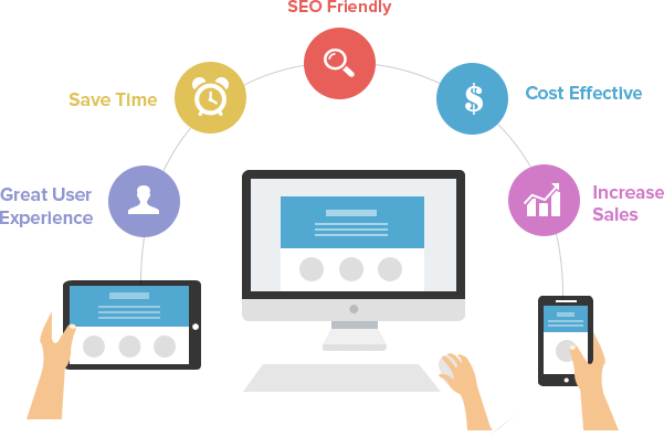


Responsive Web Design is about using HTML and CSS to automatically resize, hide, shrink, or enlarge, a website, to make it look good on all devices (desktops, tablets, and phones)
Eliminating User Frustration
At Dreamster Technologies we are determined that we make only responsive websites for our clients. It is the need of the hour indeed.<br /> If your website is not mobile responsive then your visitors will find the pictures and text clash and in the worst scenario, it is impossible to click on a button that’s so minute in size. The solution is simple – engage your customers by deploying a responsive solution.
Engaging experiences on all platforms
It’s mobiles in the morning, desktops at the forenoon and a Tab at night. Different Customers use different devices at different times. Present your business to the customers with a responsive design that allows your website to adapt itself to different screen resolutions, automatically. This is a onetime cost-effective solution which keeps your customers comfortable with your website anytime, anywhere and most importantly on ANY MOBILE DEVICE.
Frequently Asked Questions About Responsive Design
-
Do you lose any content between the main and mobile sizes of the website?
Not really, we just bring most important parts of the content for the user. We take maximum care to ensure that no data loss across different devices.
-
How will the CMS handle the content for each size?
The CMS automatically adjusts the content for the type of device which is being used.
-
Can my current website be made responsive instead of a complete redesign?
It depends on how long ago it was developed and on which platform. Most likely it will have to be redesigned to incorporate all elements of our engagement strategy.